

Hey Hashnode! Did you know that approximately 20% of the population has some form of disability? Did you also know that everyone will experience having a disability, whether temporary or permanent, at some point in their lives?
We frequently assume that every user is the same as us when developing or designing an application. This assumption, as you can tell from the facts can’t be farther from the truth.
I’m going to give you some points on how you can make your website you’re working on right now more accessible for both disabled and non-disabled users. These pointers are based on the web accessibility guidelines.
1. Always check contrast
Fact: 1 out of 12 men is colorblind
Contrast is an import aspect that’s frequently overlooked. I often come across websites with white backgrounds and light grey. That can be extremely hard to read if you’re partially sighted. Colorblind people have difficulty distinguishing between certain colors.. Color palettes that combine both green and red or green and brown, as well as color palettes with color tints that are very close to one another, can create issues for this user group.
Always double-check if your application’s or website’s colors pass a contrast checker. You can check to see if text on a background color passes the web accessibility guidelines. I prefer to use the WebAIM Contrast Checker, but there are many other options to testing contrast, like plugins.
Do you want to go the extra mile? Check to see if the self-created images or banners on Twitter or LinkedIn pass the contrast test. Many people will be grateful to you for making that readable.
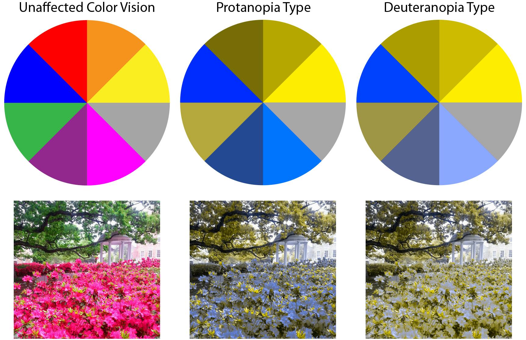 Image source: IRIS Tech
2. Add context where you use color
Never use color alone to convey a message. For example, some websites display only a red border when there’s incorrect input entered into a form. The issue is that some people are unable to tell it’s red. Include an icon or an error message with it to be sure that people get your message even if they can only see the website in black and white.
Do you want to go the extra mile? Use the ‘let’s get colorblind’ plugin for Chrome or Firefox to see if your application or website is still fully usable if there is a lack of color or no color at all.
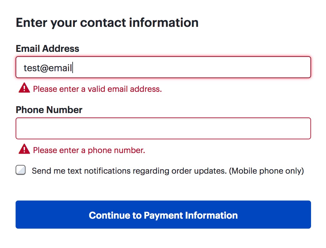
Image source: Nielsen Norman Group
3. Add alt-text to images
I believe this is quite common practice already for a lot of front end developers but if you aren’t doing it yet, add alt-text to images so screen readers can explain what the image is about. This is important, especially with images that have a lot of context.
Do you want to go the extra mile? If you’re using videos or audio on your application, add captions so that people who are deaf can enjoy it too.
4. Use headings properly
We all love using h1, h2 and h3 tags, but they must be used in proper order. The h1 tag is always first, followed by the h2 tag and so on. If you want a smaller sized header before your h1 tag, don't use h3 first; instead, use CSS. It’s important for them to be in the right order for people that rely on screen readers.
5. Use semantic HTML tags
Try to avoid using divs in your HTML as much as possible. Finding an HTML tag that should be used for the section of the website you're attempting to build makes life much easier for screen readers.
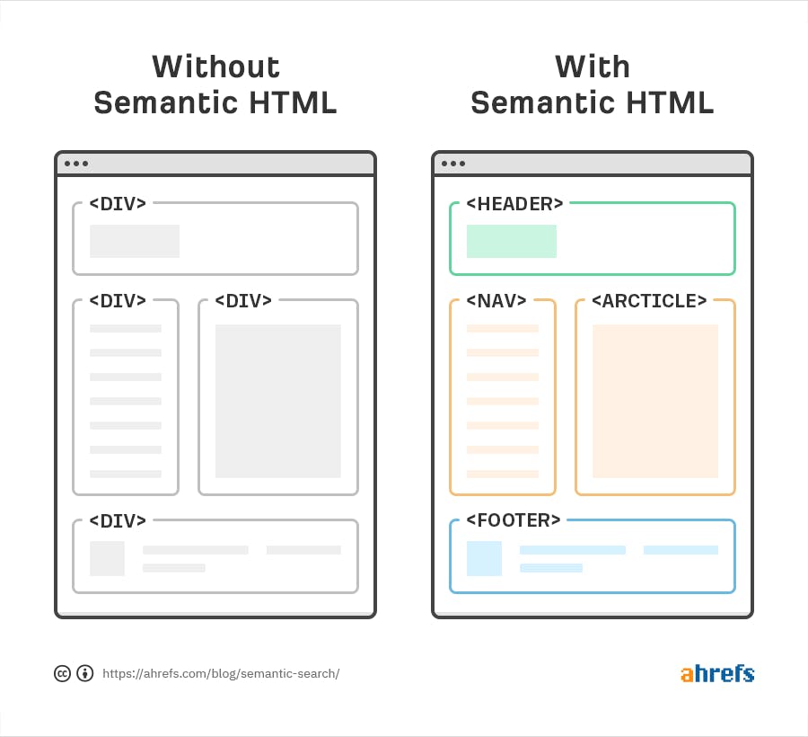
Image source: ahrefs
A website specifically for people with a disability
There are plenty of minor changes you can make your website more accessible. They are also not hard to find, If you use improvement tools like Google Lighthouse for example.
If you want to create a website specifically targeted to deaf, blind, colorblind. older people or any other group that uses websites a bit differently than the ‘regular user’, be sure to test it with at least one person from this user-group. Always check with a test user to be sure if it’s usable for them. It will surprise you what kind of issues might arise.